Painting a Fantasy Illustration With Only Three Colours
Greetings! Today I’m going to walk you through how I created my illustration “An Early Riser”. From the early sketchbook phase all the way through to the finished ink and watercolour. This was an ambitious piece for me to start with, but for some unearthly reason I felt like doing the whole thing with only three watercolours. What was I thinking?! Well, let’s find out…

A pan of Perylene Dark Red PR178 (left), and the ink line-art for the fantasy illustration (right).
It all starts in the sketchbook
Like most of my illustrations, the very first sparks of An Early Riser can be found in my sketchbook. A yellow Art Creation sketchbook decorated with a sticker of Zack from the Final Fantasy 7 universe, if we are being precise. I used this sketchbook between July 2024 and April 2025, and the very first origin of An Early Riser came about around December 2024.
An important part of my creative practice is noticing and utilising the flows of it. I go through periods of highs and lows in how many ideas come to me, and oftentimes these don’t align with the same highs and lows of other things such as time and energy! Rather than allowing myself to become overwhelmed with new ideas when I am already working on as many projects as I can or being left without any ideas when I have time to start a new project, I have nurtured a system of recording and slowly digesting my ideas. A system that enables me to get the high flows of ideas out of my head when I can’t work on them yet, and create a well to draw from in a creative drought.
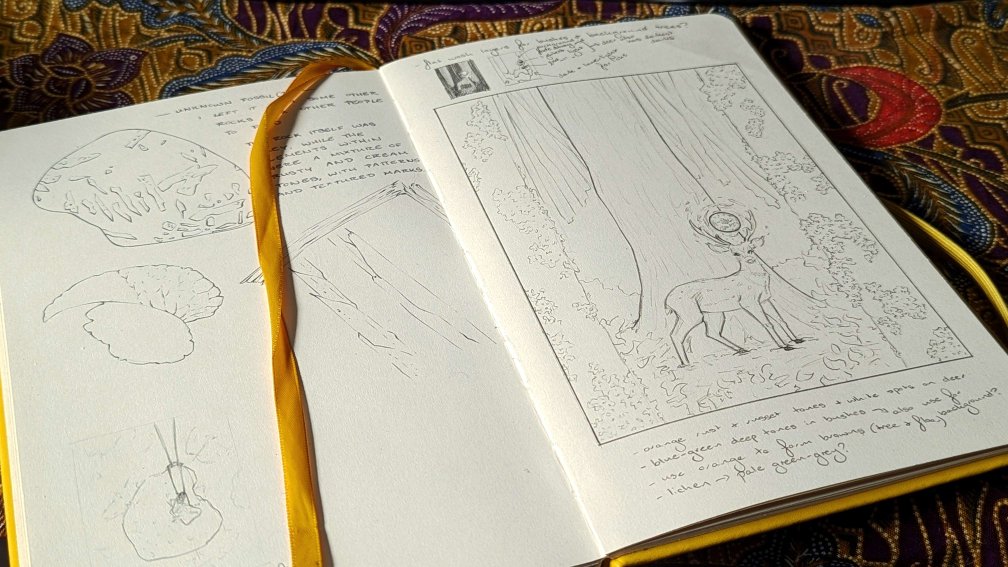
My sketchbook open to a spread of sketches. The right hand page shows the rough sketch, value study, and notes for the An Early Riser illustration.
My sketchbook is an integral part of leaning into my natural flows rather than fighting against them. I record ideas down as they come, in however way seems fitting or useful at the time. For me this is typically made up of any combination of thumbnails, written notes, and full rough sketches. I often leaf through my current and finished sketchbooks as a record of my ideas, and pull from them to create finished pieces.
A side-effect of this process is that my ideas don’t tend to develop in a neat chronological order next to each other in my sketchbook, but rather reappear over time with several pages (or sometimes a whole new sketchbook) between stages. This was true for An Early Riser, which began its life as a thumbnail around December. I was coming up with ideas for a community collaboration that was taking place in January. While I loved the idea I ultimately felt it was too complex for the collaboration and settled on one of the portrait ideas instead.
Months later, stars aligned. I had just finished a 12 by 9 inch illustration and I was interested in creating another. I wanted to create a piece which had a subject within an environment, and I wanted it to have plenty of foliage elements. Of course, a quick flip through my sketchbook revealed the thumbnail and I felt like it was time. I took the original thumbnail and played around with the composition, environment, and subject. In the same sketchbook but several pages later I ended up drawing a rough sketch and tiny value composition, and wrote notes on potential colour palettes and painting effects.
Choosing a colour palette
While I was playing with the idea again, thoughts about colour palettes and combinations started to swirl to life. I had recently started playing with Perylene Dark Red (PR178) after Lana recommended it to me, so that pigment was on my mind. The seeds of an idea started to form. What if I created a triad using PR178, and only used that triad for the illustration?
It honestly didn’t take me long to come up with one. I theorised a cool yellow and cool blue would produce a useful gamut for the illustration. I did some colour mixing tests with Phthalo Turquoise (PB15 + PG7) and Azo Green (PY129), and loved the range accessible to me. I felt like the colour gamut the triad naturally created was around what I was thinking of when imagining the illustration. Something didn’t seem quite right though, and I ended up switching the Phthalo Turquoise for Phthalo Blue GS (PB15) instead. The change shifted the gamut slightly to fit what I was looking for.

Perylene Red Deep (PR178) by Schmincke. Taken after finishing the illustration. Look at that dent in the paint!
The colour palette was chosen: Perylene Dark Red PR178, Phthalo Blue GS PB15, and Azo Green PY129! The latter pigment is on my main palette, but the other two are in my expansion/playground palette. Painting this illustration was when I realised the detachable slanted wells of my expansion palette are really handy for creating multi-palette triads, because I can just pop out the colours I want to use and rest them on my main palette while I paint.
Putting pen to paper: the inking begins!
All of the prep work was complete. Now it was a matter of putting it all into motion. Life happened once more though, and by the time I actually sat down to put ink on paper I had finished the yellow sketchbook. See, not very chronologically ordered!
For the illustration I worked on Arches hot pressed watercolour paper, using a 12 by 9 inch pad. I propped my sketchbook open on my easel, and used the rough sketch and notes as reference to create an under-sketch. Mechanical pencils are my current tool of choice when starting the early stages of an illustration or painting. I used mainly my 0.9 mm HB pencil with Ain Stein lead, reserving a 0.5 mm HB pencil for finer details.

Inking the lichen textures with a micron fine-liner.
For the inking I actually used a fairly wide variety of tools for me. I used a pigma fb brush pen for the thickest lines in places I really wanted to draw the eye to. For the rest of the illustration I started with a 0.2 mm micron in the distant background, and gradually increased the thickness of the pen I used as I came closer to the viewer.
Watercolour washes and watercolour wishes
Okay, I’m going to be honest here. This was a rollercoaster of a triad to use. There were moments of pure pigment joy, and also moments that tested my colour mixing and theory to the max. I stuck to it though, up until the very end when I added a little bit of white gouache detailing to the moon. When I use white gouache for detailing I don’t typically consider it being one of my painting colours, but more of a way to produce effects like the ink lines and masking fluid.
I started out by masking off the moon, the glowy effect around it, and the white spots on the deer. Whether I mask an area or paint around it is usually decided on a case by case basis, factoring in things like the complexity of the area.
Once the mask was dry, the underpainting layers came next. This was an opportunity for me to plan where the lightest areas were, the general grouping of colours, and to establish any undertones and subtle colour variation.
The PY129 and PB15 opened up a world of vibrant greens to me, that I could mute down at will with the PR178. Conversely, the PY129 and PR178 left me with a much more limited range of muted yellows and oranges. The range of purples mixed from PR178 and PB15 was similarly limited and muted. For all the challenges this caused, the result was what I was looking for. I just had to keep reminding myself of that and “trust the process” as they say.

Close-up details of the deer carrying a floating moon. The white gouache details were the finishing touches to the illustration.
Deeper into the painting I hit the point in the process where you start to question reality, the universe, and what the ??? you are even doing. This came in two forms. Mixing the earth tones, and judging the painting on how it looked before the shadows were applied.
I was in a tight-rope walk. One where I balanced between being in a painted cage of my own creation and being free to utilise my experience and push the limits of three colours. I was doing so much mixing to create the neutrals. So much mixing. Towards the final layers of the trees I was both ecstatic over the effect I was producing, and begging for my earth tones sitting further down the palette.
Part of the painting I knew would exist from when I first set about creating the value thumbnail was the shadow effect. I wanted to create an almost vignette-like shadow, albeit subtle, that would frame the viewer’s perspective. Despite knowing it would eventually be there, I could feel the absence of it while it wasn’t. That absence sometimes skewed my perspective on how the illustration looked while I was still working on it. Thankfully I have been through enough paintings and drawings now to recognise when I am in “the ugly phase” and to just keep going when that happens.
When it came to the triad itself, one thing I noticed quite quickly was that the PR178 had less tinting strength compared to the other two pigments, despite being quite a good tinting strength itself. The picture taken in the choosing pigments section shows the pan after finishing the illustration. The pan had been freshly poured with paint that was then allowed to dry, so the dent in the paint was entirely caused by just this illustration. Interesting to note!

An Early Riser, 9 by 12 inches on hot pressed watercolour paper. A traditional illustration drawn in ink and painted with watercolour and gouache.
Overall I am really happy with the result, and I’m glad that I stuck with my plan through to the end. Things never usually work out in straight lines, and the ups and downs of the creative process are no exception. Do you tend to notice that in your own creative practice?
That’s all for now. Happy painting and drawing!