Behind the Pencil
Welcome to my artist journal where I document and share my creative life and passions
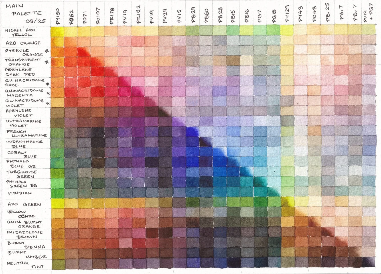
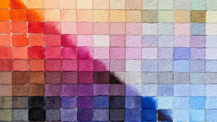
Main Watercolour Palette Tour 2025
After a couple low-buy years of restocking paints, 2025 was a year of exploration and experimenting with my art supplies and watercolour palettes. I developed a main/expansion palette system for myself, and tried new pigments to expand my colour mixing knowledge and find replacements for discontinued favourites. My updated palette reflects everything I learned this year. In the process of experimenting, I learned a lot about myself and what works for me. So I decided to update my main watercolour palette to reflect everything I discovered. Enjoy a colour mixing chart of the new palette, which tested my patience!

The #onlyTHREEpigments Artist Challenge
In this desert-island scenario I'm choosing a limited palette that I would hypothetically spend the rest of my life with. It was a difficult choice, and made me consider what pigment properties are the most important to me such as transparency and granulation. Want to join in? This challenge is open to the art community. At the bottom of the post you can find different ways to join!
So I may have done something to my main palette
I confess, there have been some big changes to my main watercolour palette. Thanks to the painting system I started using towards the start of the year, I’ve discovered more about what helps me in my painting process. This palette upgrade takes what I’ve learnt and applies it, to hopefully make my process even more enjoyable and suited to my preferences. For some reason I decided to test my artistic patience by hand painting a full palette mixing chart to commemorate the occasion.

Binder splitting from dried watercolour
Binder splitting from pigment in paint tubes is a common occurrence with some easy fixes, but did you know binder can separate even from paint on your palette? What can you do when this happens? Well, the answer isn’t quite as simple as stirring a paint tube.
How I Mix Earth Tones From Orange
Let's demystify how to mix a range of earth tones using orange in watercolour. From deep browns to earthy reds and yellows. I'll take you through my thought process with the example of mixing with Pyrrole Orange. We'll look at a finished painting and mixing chart using this orange, and how I mixed earth tones with it. Earth pigments are wonderful for convenience, so why learn to mix earth tones without them? It can help you practice colour mixing theory, learn how to make interesting hues, and help increase the range of limited palettes for you to use. Mixing with complementary colours is a staple part of colour theory, yet there are a whole world of mixes available to you by utilising near-complements too.
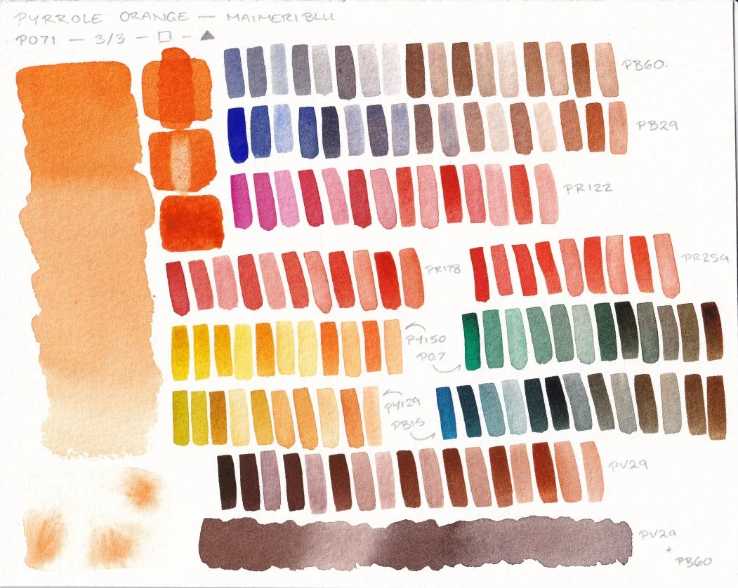
Pigment Exploration: Pyrrole Orange PO71 (Maimeri Blu)
Can I fall in love with Pyrrole Orange? Let's find out! Today I'll share a mixing chart featuring its pigment properties, and some colour mixes with my favourite everyday pigments. I made sure to use the same pigments as for the Transparent Orange PO107 chart, so that the two oranges can be compared.

Pigment Exploration: PO107 Transparent Orange
Transparent Orange PO107 from Winsor and Newton is a relative new and uncommon orange pigment in the watercolour scene. Let's explore some of its pigment properties and create a colour mixing chart with some of my favourite pigments. I'll also share my experience using it as part of a limited palette for an illustration.

The Quest to Find My Dream Red-Orange
With my favourite watercolour pigment discontinued and running out, I now embark on a quest to find its successor. With colour mixing charts at the ready and limited palettes to explore, who will be the victor? The warm red throne lay empty, waiting for its new monarch.

Pigment Exploration: Quinacridone Violet PV19
Watercolour pigments often have a range of hues and properties available, and PV19 is a great example of this. When I was a beginner to watercolour I started with a split primary that used Quinacridone Rose as the cool red. Years later, I am curious about its sister Quinacridone Violet. Both are the same pigment number, but with very different hues and producing different colour mixes as a result. Let’s dive in to some first impression discoveries about Violet-PV19!

Celebrating My Favourite (Discontinued) Warm Red
Art supplies change or get discontinued entirely more frequently than people may realise. Rather than letting discontinuations be all doom and gloom, I want to share with you all the joy and help that an old pigment has given me in my painting practice over the years. Today we’ll be looking at Transparent Pyrrol Orange by Daniel Smith - but the much redder version that was discontinued before 2019 - and the process of a tiger painting.

Palette Check Up: Is the New System Working?
A few months ago I changed my watercolour palette set up to see if it would help my painting process and creativity. Now that I have experience using the new palette system in practice, do I think its working for me?

Painting a Fantasy Illustration With Only Three Colours
Can you create an illustration with three watercolours? Let's find out as I take you through my process of creating my traditional fantasy illustration “An Early Riser”. Starting with the sketchbook process, choosing the colour palette, and then diving into the illustration itself. I’ll share the highs and lows of my creative process, and how through it all I form a consistent art practice.

Exploring Jackman’s Watercolours With a Limited Triad
Watercolour triads are an amazing way to explore new watercolours on a smaller budget, and to increase your colour mixing knowledge through limitation. I selected three pigments I have not used before to create an unusual yet practical limited palette for my self study and plein air adventures. All from a new-to-me watercolour brand Jackman’s Art Materials. Earthy greens mix with rich orange-browns, set against deep purples in this textural trio.

Painting Bella for International Pet Day
A peek inside my thought process for creating a watercolour pet portrait of Bella, a sweet elderly dog for International Pet Day.

The Reality of Sketching Animals From Life
Ever wonder what is actually like trying to draw or paint moving animals from life? Join me as I take you through my sketching trip at Yorkshire Wildlife Park, including all the highs, lows, and surprises that sketching outside brings! There are things you can do in advance to help prepare you for success, and to determine what that success even is for you. However, a lot of the skill building will come from actually putting pen to paper on the day itself, despite all the chaos nature and other people may throw at you.

Preparing for Drawing and Painting Animals From Life at Yorkshire Wildlife Park
Sketching moving animals from life is a unique challenge, but is there a way to help prepare yourself for it? In this post I share how I prepped for a sketching trip at Yorkshire Wildlife Park, and a simple exercise to do at home that helps bridge the gap of drawing animals from reference images and animals from life. I also talk about how I choose my art supplies for the travel kit, and how preparing my creative mindset is integral to my self-studying practice.

An Odd Six Colour Limited Palette
Exploring my new six colour limited watercolour palette with an unconventional split primary yellow. I use Azo Orange for the warm yellow and Azo Green for the cool yellow, and explain how I can mix a yellow from the two. Let’s dive into some colour mixing and a sketchbook test with a leopard portrait.

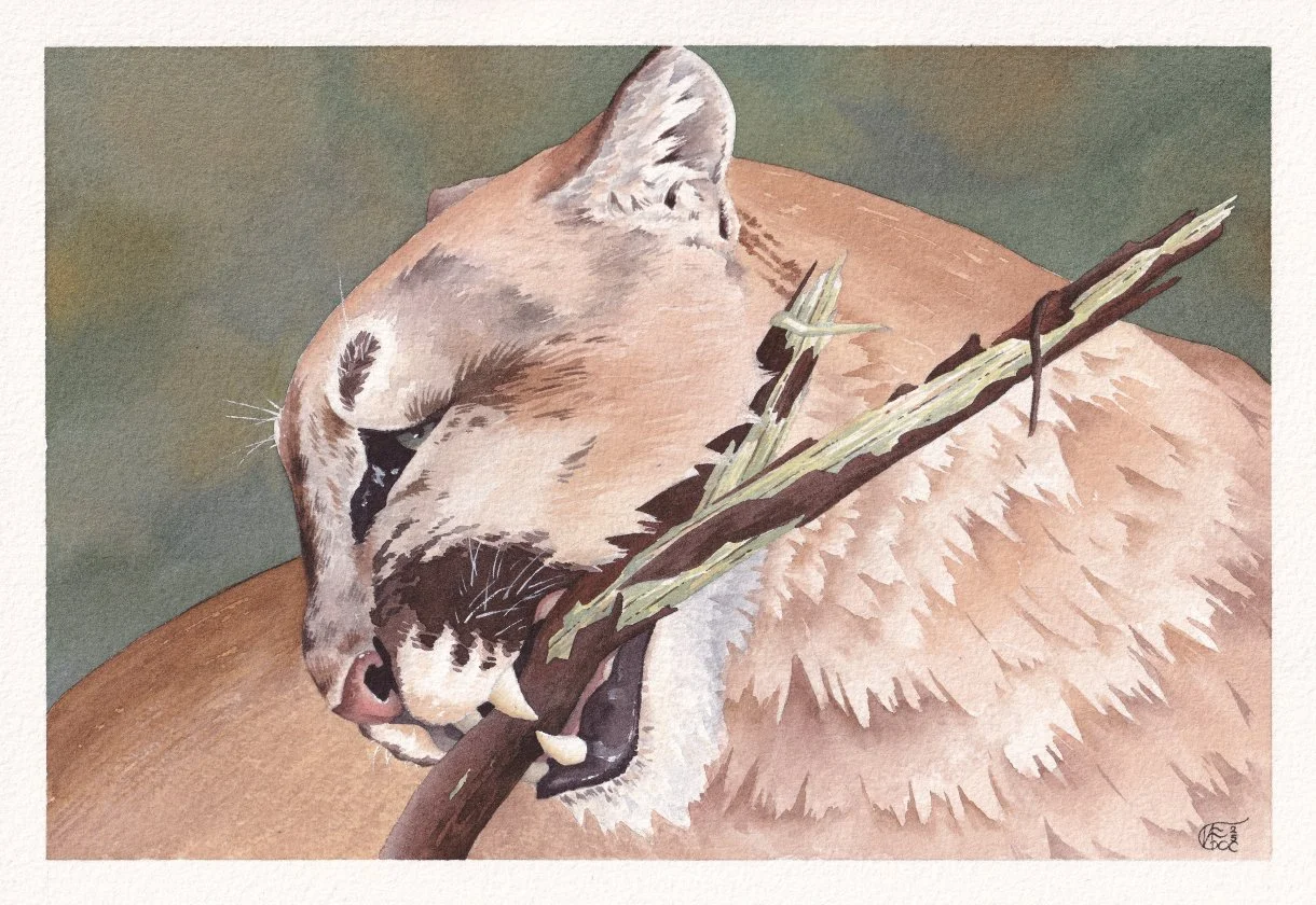
Embracing Granulation in Watercolour
How do you handle very intensely granulating paints in watercolour? Join me as I walk through how I planned the painting of a lion portrait in watercolour and gouache to account for the heavy granulation of French Ultramarine PB29 by Schmincke.
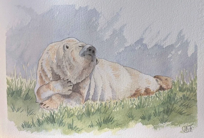
Practicing for Painting Animals From Life - Polar Bear Edition
Explaining my self studying method to prepare myself for painting animals from life this year. I share my process and thinking by talking through a recent pencil and watercolour sketch I did of the polar bear Hamish. The goal-focused method involves considering the materials, conditions, time constraints, and approaches required when painting a moving animal on location.