So I may have done something to my main palette
Greetings! I have a confession to make…
There’s been a change to my main watercolour palette.
Okay, I admit there’s been some rather big changes to my watercolour palette. Ever since I started using a new palette system at the start of the year, I’ve been using the Holbein RP-24 as my expansion palette. I ended up falling in love with it and how my painting process has streamlined as a result. The longer I’ve been using the main/expansion palette system, the more I’ve discovered about my current painting needs and what makes me happy while painting. I took what I learnt and adjusted my main palette to even better suit my needs.
Why update my main palette?
To catch you up to speed real quick, the Holbein RP-24 uses slanted wells but they can be detached and moved around. I prefer using slanted wells over full pans, and with the RP-24 I get to experience the best of both worlds. To hear more about my palette system and how it fits my personal painting needs well, check out the blog post I linked above.
After some reflection, in August I decided to take the plunge and finally upgrade my main palette. The palette I was using has been with me since — checks notes — around 2017. It was a cheap and simple plastic palette with 18 slanted wells, and some red stains from a paint spillage accident in its first year of use. One of the paints didn’t survive a visit to Wales, and decided to go on an adventure all over my palette and bag instead. I have finally parted ways with the palette, and it’s going off to a new home now to bring joy to someone else.
I did scrape out most of the paint and transferred them into RP-24 wells, with a couple of exceptions that were too difficult to remove (treats for the new owner!). You can see me do the same process in the video where I set up my expansion palette, if you’re curious about transferring paint.
The main advantage of having two RP-24 palettes now is that I can quickly move paint from the expansion to the main palette and back. This is useful on a temporary basis for making limited palettes for a painting/illustration, when I may want to use paints I keep on my expansion palette like Ocean Blue by Holbein. When I painted The Fisherdess back in May, I detached the Ocean Blue well from the expansion palette and rested it on the mixing area of my main palette while I painted. It’s an interesting “special effect” paint to me, and one I would only reach for in specific circumstances. I used it for the background to produce the blue/yellow granulation. Now I can swap around colours before a painting, and not have them loose on the palette while I’m working.
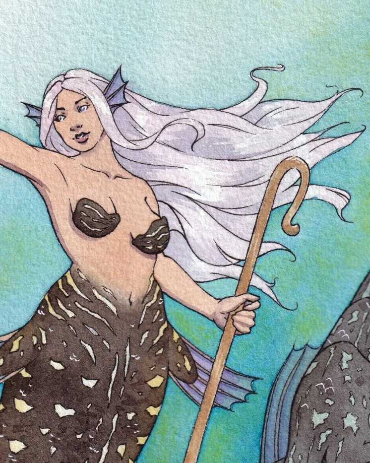
A close-up of The Fisherdess (2025), with Ocean Blue in the background.
The other advantage is more long-term. Since my entire paint collection is in both palettes now, I can change the layout of my main palette more easily. Besides the new ability to temporarily change my main palette for individual paintings, when I come to change my long-term selection of paints in my main palette I’ll have a much easier time. Before this, I would have to wait until a well was free to change a colour. Either when a colour was used up, or by scraping out the paint to transfer somewhere else. This also made it difficult to keep a consistent arrangement of pigments by colour group. I like to keep my main palette in order from yellows through to reds, pinks, purples, blues, greens, earth tones, then finally neutrals. If I wanted to add a yellow but only a blue spot was free, that would mess up the order.
It’s not an end-of-the-world scenario, but for something you use frequently having it set up in a way that both helps you and makes you happy is a nice thing to strive for.
Testing my sanity with a full-palette mixing chart
For some reason, I decided to commemorate this moment by doing a full mixing chart of the new main palette set-up. I don’t do these types of colour charts often, at all. There’s a different type I prefer for learning colour mixing and understanding relationships between pigments.
These full-palette charts take time. A whole lot of time. I started the chart back in late-August and slowly added rows to it over the course of a month, finishing yesterday. Below is a sneak peek at a section of the mixing chart. The high resolution scan of the full chart is this month’s treat over on my Patreon, including a first-look at all the pigments I’ve chosen.
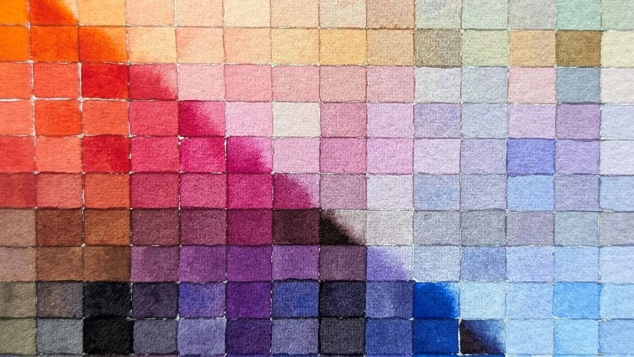
A close-up of the colour mixing chart for my updated main palette.
Towards the new year I’ll film a video covering the main palette, my pigment choices, and so on. If you have any questions you’d like me to answer in that video, leave them below. Now I must away to drawing-land. Talk to you later!