Behind the Pencil
Welcome to my artist journal where I document and share my creative life and passions
Main Watercolour Palette Tour 2025
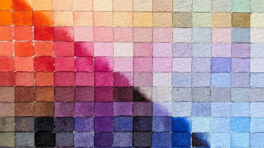
After a couple low-buy years of restocking paints, 2025 was a year of exploration and experimenting with my art supplies and watercolour palettes. I developed a main/expansion palette system for myself, and tried new pigments to expand my colour mixing knowledge and find replacements for discontinued favourites. My updated palette reflects everything I learned this year. In the process of experimenting, I learned a lot about myself and what works for me. So I decided to update my main watercolour palette to reflect everything I discovered. Enjoy a colour mixing chart of the new palette, which tested my patience!
So I may have done something to my main palette
I confess, there have been some big changes to my main watercolour palette. Thanks to the painting system I started using towards the start of the year, I’ve discovered more about what helps me in my painting process. This palette upgrade takes what I’ve learnt and applies it, to hopefully make my process even more enjoyable and suited to my preferences. For some reason I decided to test my artistic patience by hand painting a full palette mixing chart to commemorate the occasion.
Binder splitting from dried watercolour
Binder splitting from pigment in paint tubes is a common occurrence with some easy fixes, but did you know binder can separate even from paint on your palette? What can you do when this happens? Well, the answer isn’t quite as simple as stirring a paint tube.
Pigment Exploration: Pyrrole Orange PO71 (Maimeri Blu)
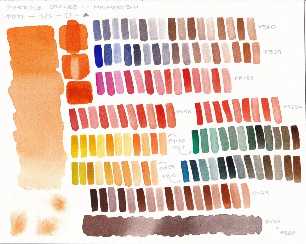
Can I fall in love with Pyrrole Orange? Let's find out! Today I'll share a mixing chart featuring its pigment properties, and some colour mixes with my favourite everyday pigments. I made sure to use the same pigments as for the Transparent Orange PO107 chart, so that the two oranges can be compared.
Giving Moleskine Another Try…
My first moleskine sketchbook ended in disaster. The binding fell apart only a few spreads in. Ouch! Three years later I’m giving it another go. Rediscovering how the paper acts with my favourite art supplies, and whether the sketchbook can hold up to daily use this time.
Pigment Exploration: PO107 Transparent Orange
Transparent Orange PO107 from Winsor and Newton is a relative new and uncommon orange pigment in the watercolour scene. Let's explore some of its pigment properties and create a colour mixing chart with some of my favourite pigments. I'll also share my experience using it as part of a limited palette for an illustration.
The Quest to Find My Dream Red-Orange
With my favourite watercolour pigment discontinued and running out, I now embark on a quest to find its successor. With colour mixing charts at the ready and limited palettes to explore, who will be the victor? The warm red throne lay empty, waiting for its new monarch.
Pigment Exploration: Quinacridone Violet PV19
Watercolour pigments often have a range of hues and properties available, and PV19 is a great example of this. When I was a beginner to watercolour I started with a split primary that used Quinacridone Rose as the cool red. Years later, I am curious about its sister Quinacridone Violet. Both are the same pigment number, but with very different hues and producing different colour mixes as a result. Let’s dive in to some first impression discoveries about Violet-PV19!
Palette Check Up: Is the New System Working?
A few months ago I changed my watercolour palette set up to see if it would help my painting process and creativity. Now that I have experience using the new palette system in practice, do I think its working for me?
Artist Q&A: Favourite Sketching Pencil and Essential Art Supplies
It’s all about my favourite and essential art supplies today, in a Q&A about sketching pencils and illustration supplies.
Have an art question you would like answered? Drop it in the comments! Anything art-related is welcome. From learning art to the creative process to drawing and painting supplies!
An Odd Six Colour Limited Palette
Exploring my new six colour limited watercolour palette with an unconventional split primary yellow. I use Azo Orange for the warm yellow and Azo Green for the cool yellow, and explain how I can mix a yellow from the two. Let’s dive into some colour mixing and a sketchbook test with a leopard portrait.


