Pigment Exploration: Pyrrole Orange PO71 (Maimeri Blu)
Greetings! My quest in the realm of orange/red continues today with a look at Pyrrole Orange PO71 by Maimeri Blu. This is a sister-post to my previous exploration of Transparent Orange PO107 by Winsor and Newton, which I’ll talk about more in a moment.
The orange version of PO71
I’m no stranger to PO71, given that my favourite warm red in a split primary system has been the discontinued Transparent Pyrrol Orange PO71 by Daniel Smith for years now. However, that discontinued PO71 was rather uniquely reddish in hue, with most other PO71s on the market being much more orange. That discontinued reddish orange is where this whole quest began, in my attempts to find a replacement now my last tube is running low. From this point forwards in this post I’ll refer to the discontinued PO71 as red-PO71 and the more common orange-leaning PO71 as orange-PO71.
I decided to learn about orange-PO71 to see how differently it acts in colour mixing, and how much the difference in hue impacts my painting experience. So I picked up a tube of Pyrrole Orange by Maimeri Blu. There are a plethora of brands to choose from for orange-PO71, and I settled on Maimeri Blu simply because I haven’t tried them before. How could I pass on an opportunity to explore two things at once?
When it came to the mixing chart, I also wanted to see what similarities and differences there are in pigment properties between the red-PO71 and the Maimeri Blu orange-PO71. The properties are particularly important to me in the search for a replacement. If the properties match, I enjoy painting with it, and I can achieve colour mixes I like then that makes a winning contender. I have other warm reds like Pyrrol Scarlet PR255 - but that fits a different purpose for me simply due to its characteristics like opacity.
Even though the hue of Pyrrole Orange is more orange, during my tests I was watching for the reds it can mix. I’m not entirely opposed to using a more orange-orange as a replacement for red-PO71, if I can still reach a range of reds I enjoy by mixing. That’s why having properties like transparency is more important to me right now, because if I can mix transparent red tones I love then that works for a replacement. Either with pigments already on my palette such as a cool red like Quinacridone Rose PV19 or Quinacridone Magenta PR122, or by creating a warm red hue by mixing in a second pigment such as Perylene Dark Red PR178 or Permanent Red Deep PR254.

Three swatch cards from front to back: Pyrrole Orange PO71 by Maimeri Blu, Transparent Pyrrol Orange PO71 by Daniel Smith (discontinued), and Pyrrol Scarlet PR255 by Daniel Smith.
Colour mixing chart and pigment properties
To get a feel for Pyrrole Orange I created a mixing chart, posted below, using pigments that I frequently paint with and enjoy. The pigments used are the same as for the mixing chart I did with Transparent Orange PO107, so I can easily compare the two. As some of you know by now my favourite method of making mixing charts is gradually shifting from one pigment to another, and occasionally watering down mixes into tints. That way I am able to see a wider range of mixes two pigments can create together in different proportions. On the left of each row I start with the pigment I am mixing with and then gradually add more and more orange-PO71 to it.
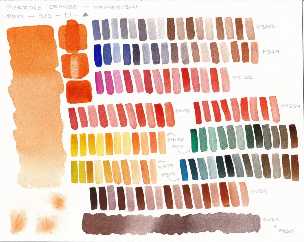
The mixing chart and pigment properties for Pyrrole Orange PO71 by Maimeri Blu.
Much like with PO107, I like the earth tones I am able to mix with orange-PO71. Particularly with Perylene Violet PV29 and Indanthrone Blue PB60. I also like the muted mixes with Phthalo Blue GS PB15 and Phthalo Green BS PG7, which correspond to colours I like to mix frequently. When it comes to the red hues I can mix, orange-PO71 produced a lot of clean and saturated tones. I’ll talk about them a bit more in the comparison to PO107 below.
On the left of the chart is a graduated wash and a few tests of pigment properties. In the bottom-left corner is a test of dropping the paint into water to see how it spreads. The paint did act slightly differently in the water test to PO107. Creating a tendril-like effect rather than naturally softening off on its own. Nothing to complain about, but something for me to take note of. The column of three squares is a glazing test, lifting/staining test, and then a masstone test (from top to bottom). The pigment is labelled as being 3/3 stars lightfastness, transparent, and staining. All properties I’m happy with.
When viewing the chart in isolation, Pyrrole Orange ticks a lot of boxes for me. The properties are what I am currently looking for, the paint behaves well, and the mixes still produce a lot of the earthy and moody hues I enjoy. In my search for a replacement for that discontinued red-PO71 I haven’t only looked at one orange in isolation though, so let’s see how it holds up when compared to another contender.
Comparison to Transparent Orange PO107/DPP
When comparing the above chart to the chart for Transparent Orange PO107 (shown below), the PO107 is slightly redder and can reach a slightly darker value than the Pyrrole Orange PO71. Transparent Orange also has a subtle earthiness to it, that reminds me of the subtle earthiness in the discontinued Transparent Pyrrol Orange by Daniel Smith.

The mixing chart and pigment properties of Transparent Orange PO107 by Winsor and Newton.
These subtle differences show through in the colour mixing too. Both make some gorgeous mixes, but with their own twist to them.
This is particularly noticeable in the earth tones featuring more of the orange (the right side of rows). Take a look at the Perylene Violet PV29 rows at the bottom of each chart. Notice the slightly redder tone to the ones mixed with PO107? It’s subtle, but visible.
The reds mixed with PO107 keep that very subtle earthiness, and even manage to get quite close to what the discontinued red-PO71 looks like when mixed together with Perylene Dark Red PR178. In comparison, the reds mixed from orange-PO71 are subtly brighter and cleaner in hue. Overall though the differences are quite small, and would largely come down to preference.
Note: high resolution scans of both mixing charts are available for free on my Patreon.
Using Pyrrole Orange in action
I’m currently in the process of testing the orange-PO71 in a full painting. Mixing charts do provide me with very useful information, but there’s so much I can learn from actually getting stuck in with a painting or illustration. I learnt a lot about PO107 with the illustration I made using it in a limited palette. I wouldn’t want to miss out on the same opportunity to learn more about orange-PO71.
I’ll share my findings in a future update, but for now I’ll leave you here. Happy creating!