How I Mix Earth Tones From Orange
Greetings! As promised, I continued my exploration of Pyrrole Orange PO71 by MaimeriBlu by creating a painting prioritising that pigment in a limited palette. Today I’ll share some of my thoughts about the painting process, while also giving you a little insight into how I mix earth tones using oranges. Let’s dive in!
Why mix without an earth pigment?
I love a good earth tone. A couple of my favourite pigments are earth tones, in fact. I keep earth tones on my palette for convenience, but I can easily mix earth tones using just the primaries and secondaries on the palette instead. Doing this I may discover interesting muted, earthy, or neutral tones that I want to continue using in future paintings.
Another benefit to learning how to mix earth tones is that it opens up the opportunity to create a variety of limited palettes from primaries and secondaries. One way to achieve colour harmony (a unified look to the colours) or a particular colour mood in a painting is by creating a colour gamut mask. I wont cover gamuts and masks in depth here, as they’re a whole topic to dive into on their own. Basically, you can plan the colour range of a painting by choosing a limited number of paints that only mix colours within your planned range . If you would like to know more I highly recommend James Gurney’s explanation of colour masking.
Colour theory: mixing earth tones from orange
In basic colour theory, the classic method of muting colours down is to utilise complementary colours. Pairing colours that are opposite each other on the colour wheel, such as orange and blue. Note how it is complement and not compliment. That is because they complete each other, to produce chromatic greys and blacks.
Using the complement of an orange paint is one avenue for mixing earth tones too. By mixing more of the orange and less of the blue, you can mute the orange just enough to produce some earthy browns. These browns will neutralise the more blue is added, gradually becoming more of a warm grey and then a cool grey. On the mixing chart below you can see this effect on the PB60 (Indanthrone Blue) and PB29 (French Ultramarine) rows of mixes.
While these are useful mixes to know for making earth tones from oranges, there are other possibilities available to you. Some of these are even my favourites! Let me introduce you to the wonders of mixing orange with near-complements…
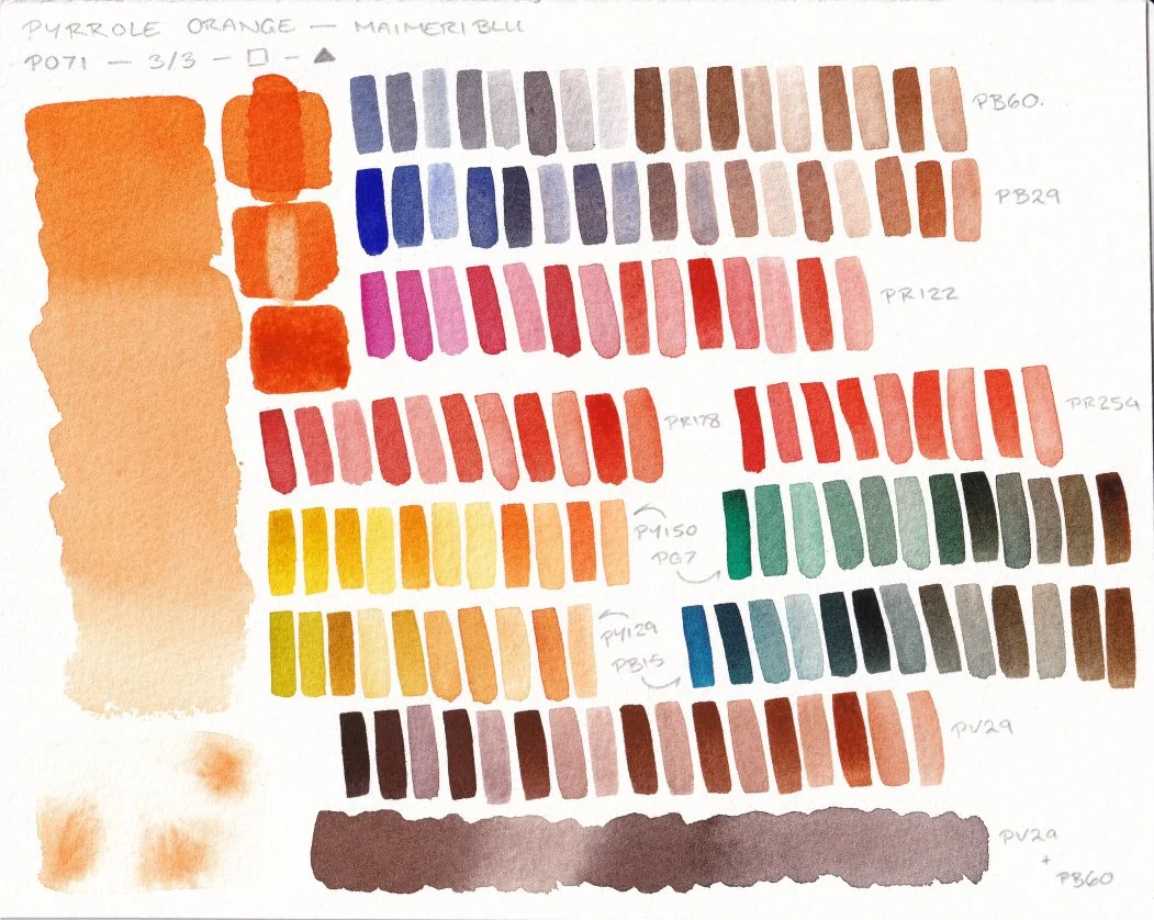
A mixing chart for Pyrrole Orange by Maimeri Blu, with pigment properties and colour mixes.
Mixing browns with Pyrrole Orange PO71
One thing to note is that the complement to an orange will depend on the hue of the orange. A more yellow-orange will be opposite “warmer” blues (blues that start getting closer to purple), and a more red-orange will be opposite “cooler” blues (blues that are closer to green). For Pyrrole Orange, the warmer blues such as PB60 produced the most neutral greys compared to the cool PB15 (Phthalo Blue Green Shade).
Once you can identify the complement, you now also know what the near-complements to that orange are. The near-complements are the hues on both sides of the complement. To illustrate this with Pyrrole Orange, let’s say the warm blue PB60 is the complement. If we imagine where PB60 is on the colour wheel, to one side of it is blue-violet then violet and on the other side are cool blues then blue-greens. Those are the near-complements for Pyrrole Orange. When mixed with orange they still neutralise a little bit, but less so than the actual complement.
Another way to think of it is: the further away a colour is from Pyrrole Orange on the colour wheel, the closer it is to the complement and the more it will neutralise Pyrrole Orange.
So even though PB15 is not the complementary blue, it can still neutralise orange enough to make earth tones. Take a look at the PB15 row on the above mixing chart, focusing on the right-hand side of the row where more orange was used in the mixes. If you look at the row above that for PG7, which is a blue-green, there are also some interesting earth tones.
If we jump to the other side of the complement and look at violets, a similar thing occurs. The bottom row of mixes is with PV29 (Perylene Violet), and makes a gorgeous range of browns. Since they are near-complements they neutralise each other just enough to produce earthy colours but they still retain either a purple, red, or orange tone to them. This can be neutralised further by adding blue to the violet, which makes it closer to the complement of Pyrrole Orange. I show this in the swatch at the very bottom of the mixing chart labelled PV29 + PB60.
Take a look at the below painting, and see if you can identify some of the mixes from the mixing chart.
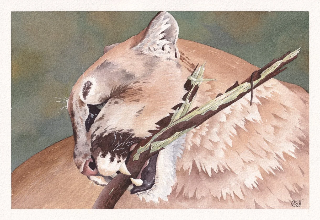
All Natural Chew-Stick, 2025. Watercolour and white gouache.
Mixing yellow earth tones with Pyrrole Orange PO71
To mix yellow earth tones for the above painting I took a slightly different approach, but it still involved understanding the colour wheel and neutralising colours.
I mixed Pyrrole Orange with PY129 (Azo Green/Green Gold). That was it, that’s how I made yellow earth tones. What wizardry is this, some of you may ask. Well yellow is between green and orange on the colour wheel, and if you mix those two together you can sometimes make a neutralised yellow that looks pretty. I say sometimes, because yellow is a very weird colour. Yellow only looks “yellow” within a very small range before it starts getting too muddy to look yellow and instead looks baby-poop-brown. This can also be referred to as a colour retaining its colour identity. Yellow only retains its colour identity within a small range.
In my own experience I can only really pull it off by mixing an orange with a very yellow green, so PY129 fits the role perfectly. If you go back to the mixing chart, you can see some of these yellow earth tones on the PY129 row of mixes. In the painting I used them for the teeth, and to make some lighter browns with the addition of PV29.
There are of course other ways to mix yellow earth tones, especially if you consider using three pigments, but this is one of my favourite methods. I personally prefer it over using yellow’s complement violet to neutralise it slightly, because it tends to make hues I don’t find subjectively appealing.
Thoughts on Pyrrole Orange PO71 so far…
Pyrrole Orange was really pleasant to paint with. Both in terms of the mixes it made and how it handled. After finishing both the mountain lion painting and the mixing chart, I was left satisfied with the paint. Unfortunately that meant I was also left with a dilemma.
This whole orange pigment journey started as a playful way for me to find a replacement for a colour on my palette. The discontinued Transparent Pyrrole Orange by Daniel Smith from before 2019. It has turned into an unexpected series of sharing my experiences with orange pigments and painting with orange. Yet the original goal remains. Beneath all the fun, I’m still trying to find a replacement that fits my preferences.
Out of the two oranges I have been experimenting with so far, there isn’t a clear winner. I prefer how Pyrrole Orange handles while painting. It has a lovely balance of qualities that fit how I like to paint. However, I prefer the slightly redder hue of Transparent Orange and its subtle earthiness. Both produce lovely mixes, just with different qualities. The mixes of Pyrrole Orange are bright and clean, while the mixes of Transparent Orange carry that subtle earthiness. Alongside the Pyrrole Orange mixes leaning more orange and the Transparent Orange mixes leaning more red. Both are pretty, both are potentially useful. Which one is “better” would come down to situational needs and subjective preferences.
No clean winner, means a difficult decision. It also means more painting to help me figure things out though. Oh no, whatever will I do! Haha.